Part I: England, Scotland, and Wales,1901-2001
Sandra
Arlinghaus
and Michael
Batty
Dr. Sandra Arlinghaus is
Adjunct
Professor at The University of Michigan, Director of IMaGe,
and
Executive Member, Community Systems Foundation.
Dr. Michael Batty is Bartlett Professor of Planning at
University
College London where he directs the Centre of Advanced Spatial
Analysis.
Please
set screen to highest
resolution and use a high speed internet
connection.
Please download the most recent free
version of Google
Earth®.
Make sure the
"Terrain"
box in Google Earth® is checked.
England, Scotland, and Wales: Rank-size Plots, 1901-2001
Rank-size plots have been used for years in a number of contexts: large sizes have small numeric ranks--the largest city in a region has rank 1 (the smallest numeral). Discussions of these plots, merits and drawbacks, example suited and not suited for application, and a host of related matters persist in the social scientific (and other) literature. Our focus in this internet paper is on the geometric visualization of rank-size relations: not only as plots but also in other ways that have come about as a result of contemporary electronic and internet capability. Figure 1 shows a rank-size plot, done in the classical manner, of data for 459 towns and cities in the United Kingdom. Each separate plot shows the rank-size curve for a particular year. The data set is ordered for each of 11 decades as noted in the legend of Figure 1. The goal is to look at change over time.
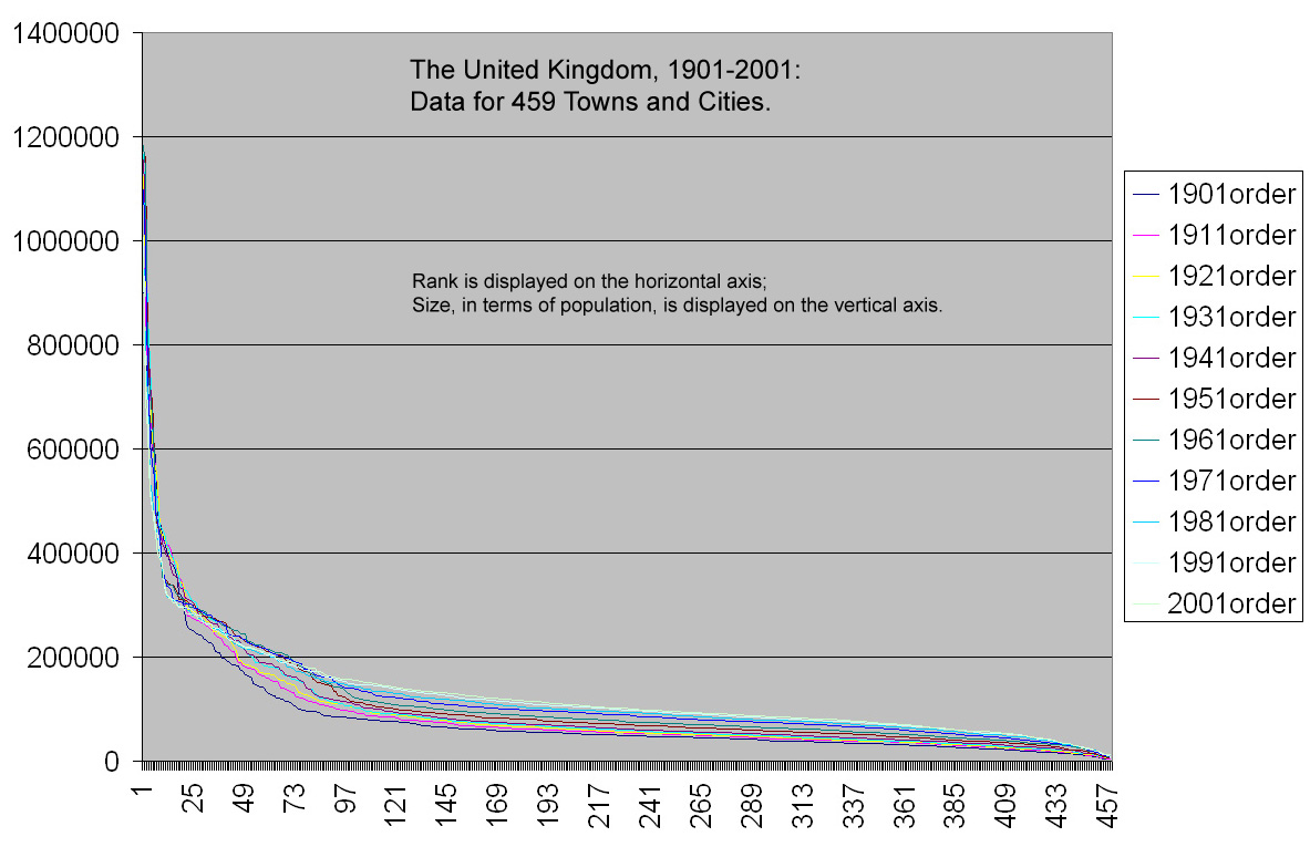 Figure 1. Rank-size plots of the UK data by decade. |
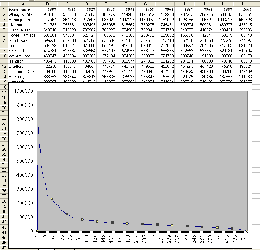 Figure 2. Envisioning fluctuations in the UK data set based on changes of individual city or town ranks over time. This animation shows the 1901 rank-size plot as the benchmark against which to visualize other decades. |
Rank changes over time; if one wishes, however, to understand why such changes occur it may be important to know where the cities and towns are in relation to each other and in relation to other variables such as the natural and built environments. Geographical Information System (GIS) technology permits the association of databases with maps: a change in the underlying database produces an associated change in the map (and vice versa). Flat maps made using GIS technology can be "inflated" to have a 3D appearance, and saved as Virtual Reality (vrml) files and viewed on the internet using a plug-in for the browser. Terrain can be introduced and databases can be viewed against terrain models (such as Triangulated Irregular Networks). What this approach cannot do is place the spatial model on a globe: it is conceived with flat maps.
Base Maps on the Globe: England, Scotland, and Wales
To overcome this noted limitation of GIS software, we use Google Earth®. As a first step, we create an inventory of base maps of the United Kingdom from materials already available on the Internet. The materials listed below are presented in an animation in Figure 3 to give the reader a sense of how boundaries fit together and of how towns and cities are arranged within those boundaries. In order, the frames of the animation of Figure 3 are:
- a global view of the UK
- a view of the UK showing national boundaries [see linked
material
in reference section to Valery35 and Barmigan]
- a view of the UK showing county boundaries with no labels
[see linked material in reference section to Valery35 and
Barmigan]
- a view of the UK showing county boundaries with labels
[see
linked material in reference section to Valery35 and
Barmigan]
- a view of the UK showing cities and towns with labels;
towns and
cities are elevated, as stars perched atop a line,
reflecting relative
sizes [see linked material in reference section to Bowman]
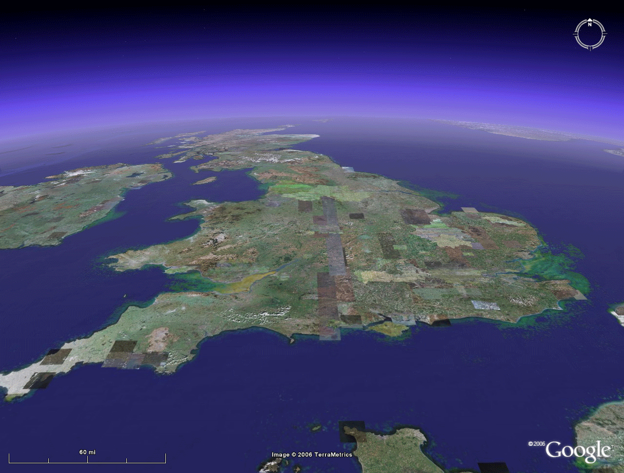 Figure 3. Base maps of the UK from Google Earth. Click here to view a .mov file in which the reader can control the animation rate. |
The image in Figure 4 shows size data, from Batty's extensive database, for a selection of towns in England, Scotland and Wales for 1901. At a glance one can see the location on the globe of large cities in relation to small towns. The parallelepipeds anchored on town or city location are scaled according to town or city population. A town with a population of 125,367 is, for example, represented by a parallelepiped of height 125,367 feet, located at appropriate position on the Google Earth® ball. The result is shown in Figure 4a. Notice that Glasgow indeed has the tallest structure while the City of London and its boroughs show the densest concentration of population. If one wishes to add a single figure for all of Greater London, the result is shown in Figure 4b. All the 1901 population bars are shown on the animated base maps of Figure 3.
 Figure 4a. 1901 population size mapped in Google Earth®. Height of parallelepiped reflects directly population size of associated town or city. Click here to view a .mov file in which the reader can control the animation rate. |
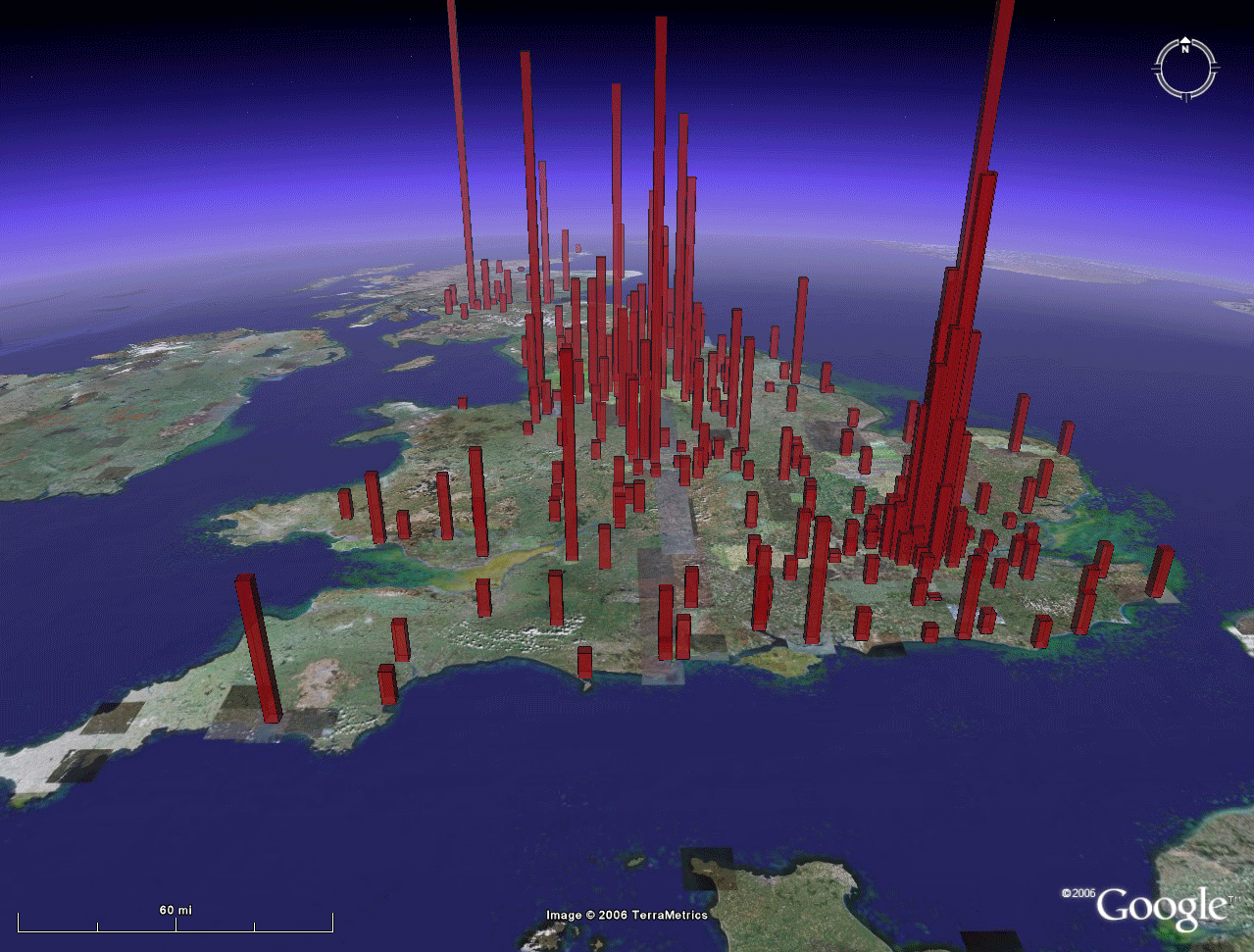 Figure 4b. 1901 population size mapped in Google Earth®. Height of parallelepiped reflects directly population size of associated town or city. A single figure for Greater London has been added to this image from Figure 4a above and this parallelepiped rises far above the edge of the image. Click here to view a .mov file in which the reader can control the animation rate. |
The Greater London parallelepiped actually rises far above the edge of the animation. One gets, from this animation, simultaneous views of:
- the
location
of population clusters in 1901 in England, Scotland,
Wales.
- an understanding of adjacency patterns of these locations
- an understanding of where places and clusters of places are in relation to national and sub-national boundaries
- an
understanding of where places and clusters of places are
in relation to
the natural and built environments.
- Download the linked file (if you have not already done so from the box at the top of this article) and save it on your computer.
- Then, open Google Earth® and go to File | Open.
- Navigate to where you saved the downloaded file.
- Open it.
- Drive
around in Google
Earth®;
look at data in different subdirectories within the
downloaded file. Once
this file
and the
subordinate files come up in
Google Earth®,
manipulate the Google
Earth navigational devices in the
upper right corner to change viewpoints. Zoom
out; drive
around throughout the UK countryside. Double-click a
single layer. Try to determine your position.
Look at the
linked Swansea
animation
(.mov file)
and note that
the parallelepiped is made of tinted glass so that one can
see through
the object to keep track of the
landscape. Zoom out to a more global scale to
see how much
the Greater London parallelepiped soars above the
others.
As has Batty's recent article in Nature on "Rank clocks," the images in Figure 4 give new meaning to the base plot of the 1901 rank-size curve of Figure 2. They are rich in information and capture, as well, adjacency and positional information not present in Figure 2. When one considers them in Google Earth, itself, the opportunity to extend these advantages to all geographic scales, from the local to the global, is an automatic addition as is the opportunity to view them as virtual reality over which the user has total control.
DOWNLOAD, IN ADDITION, A FREE VERSION OF GOOGLE SKETCHUP
DIRECTIONS
GIVEN
IN TERMS OF EDINBURGH, SCOTLAND, UK.
SUBSTITUTE ANY OTHER CITY/COUNTRY COMBINATION.
- Open Google
Earth®, the most recent beta
version.
- Fly
to Edinburgh in Google Earth®. Make
sure
that the terrain checkbox has a checkmark in it. Make
sure the "sidebar" is visible.
- Zoom
in to about 15,000 feet in Google Earth®, staying directly overhead. One must get at least this close
in order to
be able to bring the Google Earth® image into Google SketchUp®.
- Then,
open Google SketchUp®, the most recent beta
version.
- Go
to Google SketchUp® pull-down and select "Current
View"--the
aerial associated
with Edinburgh that was visible in Google Earth® now appears in SketchUp®
as a flat image.
- Choose
the rectangle tool and draw a rectangle to cover the
aerial as close to
exact coverage as possible.
- Use
the Push-Pull tool to extrude the rectangle AND HOLD DOWN
THE LEFT
MOUSE BUTTON AS YOU EXTRUDE IT.
- Look
up the population of Edinburgh in 1901 and extrude the
rectangle that
number of inches...type in 406368' in the lower right
slot, "Distance,"
WHILE CONTINUING STILL TO HOLD DOWN THE LEFT MOUSE BUTTON.
Hit Enter.
- Now,
a large rectangular parallelepiped appears.
- Double-click
the paint bucket to open the Materials picker. Choose
the red glass+transparent material. Dump
the
paint bucket into each of the two visible sides of the
Parallelepiped.
- Go
to the Google SketchUp® pulldown and choose "Toggle
Terrain"--that action pumps
up the terrain. Adjust the
location of the
parallelepiped in relation to the terrain, if needed (not
generally an
issue on relatively flat terrain).
- Use
the "zoom extents" tool to view the entire parallelepiped. Color the remaining two sides
and top of the Parallelepiped.
- Go
to File|Save As and save the file in a folder marked
Edinburgh, under
Scotland, under UK and save it as 1901Edinburgh.skp
- Go
to File|Export and save the file in the folder marked
Edinburgh, under
Scotland, under UK and save it as 1901Edinburgh.kmz -- or,
alternatively,
if you want to see in the context of Google Earth® what you are doing,
folllow the longer sequence of steps below:
- Now,
go the the Google SketchUp® Pulldown and choose "Place
Model"--this
action will place the parallelepiped, adjusted if need
be for terrain,
back on the terrain of Google Earth®.
- Go
back to Google Earth®.
- The
file will come up in "Temporary Places" as SUPreview2.
- Right-click
on SUPreview2 and choose Rename...rename the file
1901Edinburgh.
- Then,
with 1901Edinburgh still highlighted, go to File,
choose, Save, Save
Place As, and then save 1901Edinburgh in the
already-created Edinburgh
folder as 1901Edinburgh.kmz.
- This
.kmz file can then be sent to others, as an e-mail
attachment, and
loaded by them into Google
Earth®, by going (in Google Earth®) to
File|Open...
Multiple
aerial
pieces can be brought into the same SketchUp file.
RELATED REFERENCES
See links on author names in title material for links to publication lists.
- Arlinghaus, Sandra; Batty, Michael; and, Nystuen, John. 2003. Animated Time Lines: Coordination of Spatial and Temporal Information Solstice: An Electronic Journal of Geography and Mathematics, Volume XIV, Number 1, 2003
- Batty, Michael. 2006:
Rank clocks, Nature,
Vol.
444, 30 November, 2006, doi:10.1038. Link
to reprint.
- Bowman, Harry. Cities files from http://bbs.keyhole.com/ubb/showthreaded.php/Cat/0/Number/104614/an/0/page/0 Google Earth® Community. Last accessed Nov. 27, 2006.
- Tobler, Waldo. The
Development of Analytical Cartography. http://www.geog.ucsb.edu/~tobler/publications/pdf_docs/cartography/Analytic_2.pdf
- Tufte, Edward. 1990. Envisioning Infomation. Cheshire, CT: Graphics Press, L.L.C.
- Valery35 and Barmigen,
23.02.2006 4:20:46 generated boundary files used here;
they were
checked and updated by PriceCollins:
http://bbs.keyhole.com/ubb/showflat.php/Cat/0/Number/324595 Google
Earth® Community.
Last accessed
Nov. 27, 2006.
Institute of Mathematical Geography (IMaGe).
All rights reserved worldwide, by IMaGe and by the authors.
Please contact an appropriate party concerning citation of this article: sarhaus@umich.edu
http://www.imagenet.org